There’s no universally correct way to onboard new users to a mobile app. That said, there are certain strategies and attributes that make some mobile onboarding processes more successful than others.
What makes an onboarding process effective?
Before you can determine which strategy to use, take the time to define what “effective” means for your product. Onboarding processes can help introduce new users to your app, encourage feature adoption, and ultimately increase app retention and monthly active users (MAU). Translating these overarching goals into actionable objectives will help you determine how to use your limited onboarding real estate to have the greatest impact.
For example, if you’re revisiting your user onboarding process with the intention of boosting app retention, more specific goals may be to improve key feature adoption and earn push notification permission. Both strategies will help you create a stickier user experience and drive more consistent engagement.
When is app onboarding necessary?
It’s worth noting that not all apps benefit from a traditional onboarding flow. In some cases, creating an intuitive app interface with well-placed help text can be more meaningful than providing information upfront. That’s especially true for apps that have complex functionality, variable use cases, or have desktop-first adoption. In other instances, an onboarding process is the most efficient and impactful solution to overcome adoption hurdles and reinforce user expectations.
5 Signs Your App Needs an Onboarding Process
1. A user must provide key information before they can start using your app.
If your app requires users to create an account, set up a device, confirm their identity, or input other information to get started, then an onboarding process is a viable solution to guide them through this setup process. Examples include banking apps, medical apps, and smart home apps.
2. Content personalization is part of your app’s core value proposition.
Many content-driven apps need information about a user in order to function as intended. For example, fitness apps may ask users to provide their height, weight, activity level, and workout preferences in order to provide relevant training exercises and nutrition suggestions.
3. Your app’s functionality is contingent on user permissions or phone settings.
For apps that require access to specific phone settings such as Bluetooth, WiFi, camera, microphone, push notifications, or SMS, earning user permission and support is imperative. Onboarding flows can provide valuable context to inform opt-in decisions and reduce friction by guiding them through the configuration process.
4. Your app uses unique interactions.
Most mobile apps rely on navigational gestures such as clicks and swipes to function. Because these user interface gestures are part of the status quo, users will try them out without explicit guidance. Mobile games are an exception to this rule. In addition to clicks and swipes, many games require users to learn unique gestures or perform specific gesture combinations. If your app’s main interaction method doesn’t align with popular intuition, an onboarding process can help mitigate learning curve friction and set players up for success.
5. Your app is part of an emerging category.
It’s hard to imagine, but there was once a time when food delivery apps were a completely novel concept. When a category is still in a nascent stage, users may not have a framework of comparison to aid their understanding. If user expectations don’t yet exist for your category, you’ll need to work harder to communicate the value of your app and acclimate your user base to a new experience. Onboarding is necessary to create a positive first impression and encourage engagement.
Example Onboarding Strategies
Although there isn’t one correct onboarding strategy, there are three popular approaches. Some onboarding processes fall neatly into one category, others take a more hybrid approach.
Function-Oriented Onboarding
As the name suggests, this methodology is designed to educate users on how to perform specific functions and use core app features. Oftentimes, functional onboardings are presented in the form of a slide carousel that users can swipe through upon entering an app. They may also take the form of a guided app “tour,” where onboarding text appears within the app interface to lead users through different menu items.
Above all else, this onboarding methodology is meant to instruct and engage. For functional onboardings to be effective, they should include some form of interaction — whether that’s swiping between slide cards, tapping through highlighted features, or asking users to practice performing specific gestures.
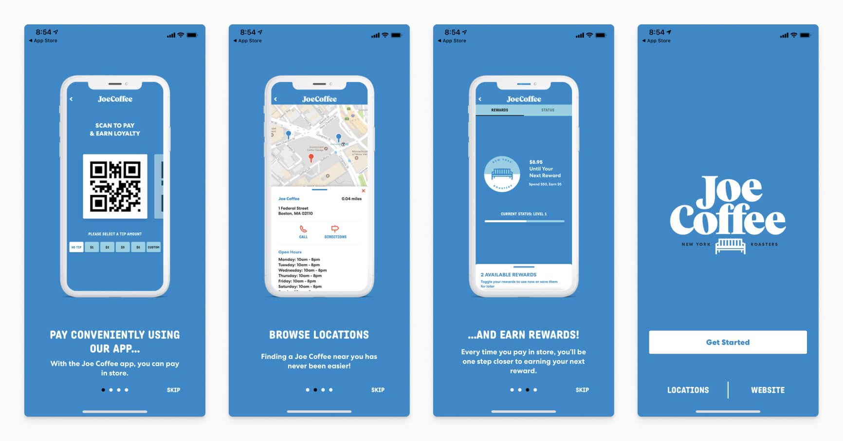
In addition to priming users for engagement, an interactive onboarding flow allows you to introduce information in bite-sized chunks and use design elements to help convey meaning. A multi-card onboarding like the one pictured above is also easy to implement using a third-party template, so you can create custom sequences for new features and make updates in an efficient and scalable way. As an added benefit, free tools like OneSignal's In-App Carousel have a variety of uses and built-in analytics, so you can test different onboarding strategies and use engagement data to optimize your approach. Unlike static onboardings, interactive onboarding flows make it easier to identify points of friction in the process and understand how users are responding to the content therein.
Benefits-Oriented Onboarding
This onboarding approach focuses on communicating the value of an app. Rather than explicitly telling users how to perform tasks, it tells the story of why they should.
In the example below, The Pattern app tells users why they should use their Bond feature — namely, to explore their compatibility (romantically and platonically) with other users and gain insight into the dynamics of those relationships. Although the images in the slides show screenshots of the feature that will allow them to do this, the card doesn't instruct them on how to use the tool.
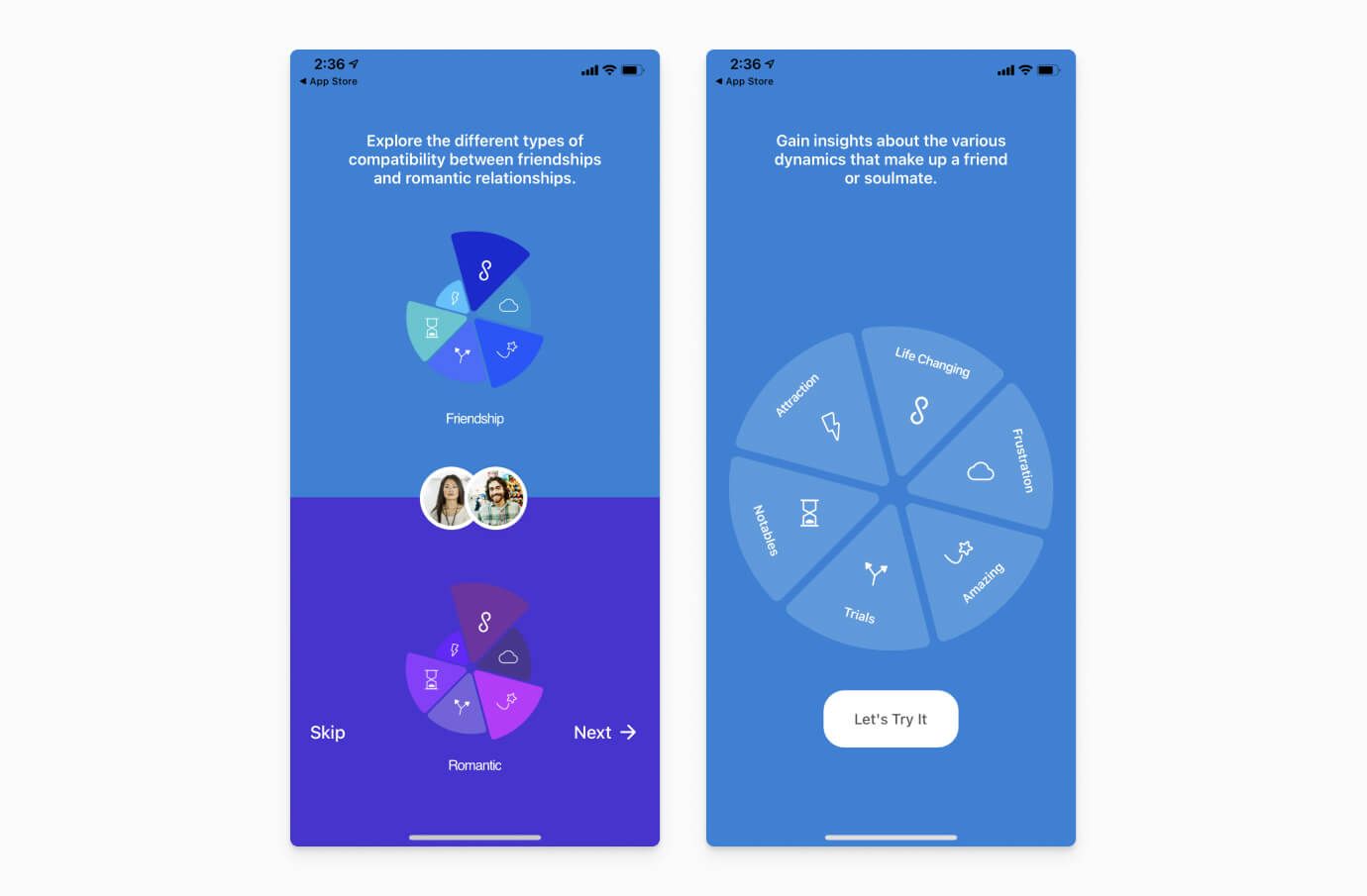
Communicating the value of using an app can be a powerful motivator. It generates excitement and encourages users to emotionally invest in the concept before getting started — two characteristics which can equate to greater app engagement and loyalty.
In addition to emphasizing value, benefits-oriented onboarding can also be used to solicit user preferences, goals, permissions, and interests in order to personalize the app experience. The fitness app, MyFitnessPal, is a great example of an app that uses a benefits-oriented onboarding approach to collect user data and personalize the app experience.
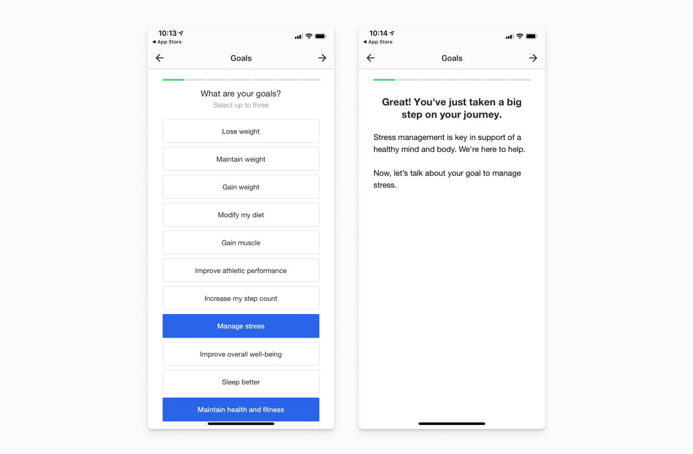
If MyFitnessPal asked users to fill out a lengthy form with their height, weight, goals, and habits upon entering the app, they'd probably see lower retention and compliance than they do with this interactive onboarding process. By personalizing the data collection process and emphasizing the benefits the app can provide, they incentivize participation in a meaningful way.
With that in mind, benefits-oriented onboardings aren't always the best solution. If your app has a complicated or unfamiliar interface that requires instruction, omitting functional guidance from the onboarding process may set users up for failure. If a user can't easily get started on their own, the value promised in the onboarding flow won't keep them engaged for long. If you're concerned about learning curve friction with core app features, your app may benefit from a hybrid onboarding flow that draws on principles from each methodology.
Progressive Onboarding
Rather than providing a formal introduction, progressive onboardings serve up helpful information as a user progresses through the app. Compared to other onboarding approaches, this methodology provides more flexibility for users to explore key features and learn at their own speed. By serving up help text or tutorials when a user clicks on specific menus or reaches different engagement milestones, you guarantee that information is contextually relevant. This approach is well-suited to mobile RPGs with unique interactive gestures or storylines, as well as apps with multiple use cases, hidden features, add-ons, or elaborate processes.

Other Tips to Improve the User Experience
Be Concise
Mobile app onboardings can vary in length from a few onboarding screens to much longer sequences. Regardless of the length or design of your onboarding process, concision is key. As a general rule, dedicating one slide card, text box, or tutorial to a single feature, benefit, or concept. If you present too much information at once, it can overwhelm users and make it difficult to remember core takeaways.
Ask for Essential Permission
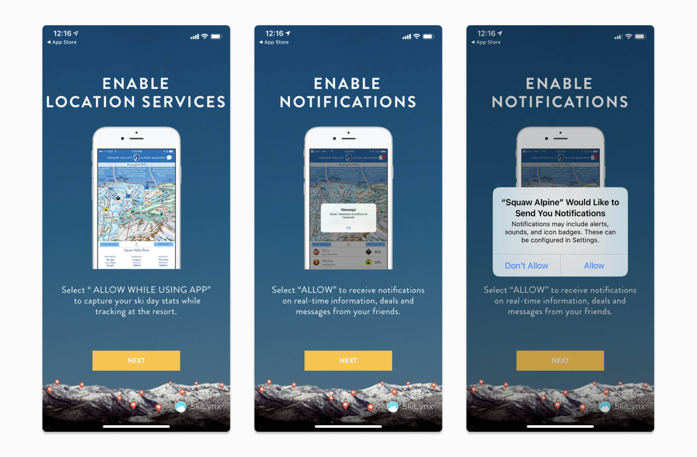
The onboarding process is the perfect time to ask for user permission and access. If your app functionality requires access to a user's camera, Wi-Fi, Bluetooth, photos, or beyond, earning consent early on can ensure a more positive first impression. Similarly, asking permission to send push notifications during the onboarding process opens up more ways to enhance your user experience and drive engagement down the road. Adding a soft prompt into your onboarding flow can help prepare iOS users for Apple's native push notification prompt and improve iOS subscriber rates.
Whenever you ask for permission, provide context before the user encounters a native prompt. By explaining why you want to send push notifications or access specific phone features, you'll give users the insight they need to make a more informed decision — and ultimately boost opt-in rates.
Cater to Your Target User
The best onboarding processes are accessible without being overly simple or didactic. As you create onboarding content, keep your core user in mind and cater to their experience level. It's OK to assume a certain level of understanding if your target audience has more tech fluency and ample industry experiences to draw upon. In other words, if your ideal user is a young, tech-savvy professional, you don't need to provide basic instructions on the more intuitive aspects of the app for the sake of inclusivity. Instead, speak to your dominant audience, account for variations within that audience, but don't level-down content for outliers.
Improve App Performance in a Holistic Way
Mobile app onboardings are just one strategy to increase adoption and drive engagement. Once users are successfully onboarded, ensuring that they remain so is no simple task. Check out the article below to learn other helpful tips to boost long-term app performance.
Get Started with OneSignal
OneSignal is designed to help you send notifications and seamlessly manage your user communication across every channel, including mobile push notifications, web push notifications, bulk SMS, in-app messaging, and email. With our in-app slide carousel feature, it's easy to create an effective onboarding flow in minutes. Create a free account to start building a better user experience today.
Get Started for Free